Seminar presentation: Word&Image in Contemporary Fiction
 Following is the presentation I gave at UTS through the Centre for New Writing on October 18, 2006. It's ridiculously long, so feel free to skip to the pictures. All images of published work are for the purpose of review, copyright remains with the publisher. All text is copyright of the author, Zoë Sadokierski, except where referenced otherwise.
Today, I’m talking about part of my ongoing doctoral research. Specifically, I’m addressing the use of graphic elements in contemporary fiction. I’m using ‘contemporary fiction’ as a loose term to mean ‘things happening now’. Most of my examples are from the past 5 or 6 years, and this is because I’m identifying an emerging narrative style.
I’m going to show some examples and talk through the way the graphic elements are integrated with written text, as well as looking at what this emerging style might mean for writers, designers and readers.
Graphic Novels
In the past couple of years, I noticed graphic novels were earning commercial interest in Australia. All of the major bookstores in the Sydney CBD have a graphic novel section, whether it’s an ad hoc shelf in sci-fi, or an entire wall awkwardly wedged between erotic fiction and romance.
While working as an in-house book designer, I was briefed to design the cover for a Jodi Picoult novel, The Tenth Circle. An international bestseller, Picoult often uses the technique of narrating each chapter from the perspective of a different character, and setting each character in a different typeface. The Tenth Circle takes this technique a step further – one of the main characters, Daniel, is a graphic novelist, so his ‘voice’ is shown through the graphic novel he’s writing as the story unfolds. If Jodi Picoult—who can shift 80–100,000 copies of a book in Australia alone—is using graphic novels, then they’ve certainly hit the mainstream.
I was excited by the prospect of playing with elements of the graphic novel in the cover design, then surprised that this was met with absolute opposition by the marketing and sales departments (well, actually not that surprised). They didn’t want this feature to be made a feature of; there was concern that the graphic novel element would turn off the ‘Jodi’ demographic. A frustrating aspect of working in commercial publishing is the perceived need to appeal to the lowest common denominator. And apparently, the lowest common denominator doesn’t appreciate graphic novels. This isn’t specific to this publisher, or even to Australia. Since the release of the Allen & Unwin edition, I’ve been looking at overseas editions and none of them have tackled the graphic novel element on the cover either. (If you look closely I did manage to sneak it in, but it’s certainly not a feature).
Asking around, the reaction from readers and booksellers was strongly divided – people either loved it or hated it. From this, I became interested in how people react to the inclusion of images in fiction. Why are some people so violently opposed to the use of graphic elements in fiction? Why are comics and graphic novels considered inferior literature?
Graphic novels are not the focus of what I’m discussing, but I think they provide an interesting point of departure for examining word and image in contemporary fiction for two main reasons:
- Graphic novelists and enthusiasts have long fought for validation and recognition of their art form in a print culture which values word over image, a problem currently faced by novelist using graphic elements in their work;
- The interplay between word and image in these multi-modal books is complex: the words don’t simply reinforce the pictures and the pictures don’t merely reflect the words – they combine to form a new language that requires reading of both text and image to make sense. I argue many works of contemporary fiction incorporating graphic elements are achieving the same thing.
On a formal level, comics are generally shorter and stapled, whereas graphic novels are longer and bound like a book. In terms of content, a comic depicts an episode of an ongoing story featuring consistent characters, where a graphic novel presents a more complete narrative; it tends to be a one-off, or an anthology that encompasses an era of a certain story. The term ‘graphic novel’ is attributed to Richard Kyle, an American comic critic and publisher, in 1964. Inspired by the popular tradition of French ‘bande dessinee’ and Japanese Manga, he attempted to “galvanize American creators and readers to aspire to similar ambition and sophistication” as their foreign, more respected counterparts. However, this description is a prime example of what some critics use to disparage the graphic novel movement – they argue that it is a vain attempt to legitimise the comic form by slapping on a label that bestows a sense of cultural importance. It’s easy to argue that the label is an inappropriate one: many graphic novels are neither graphic (in terms of their content or their visual style) or novels (many are autobiography, historical non-fiction, etc). Many writers and illustrators of graphic novels reject the label, but no one has yet offered a suitable replacement. Though I like Art Spiegelman’s definition: “comic books that need a bookmark”.
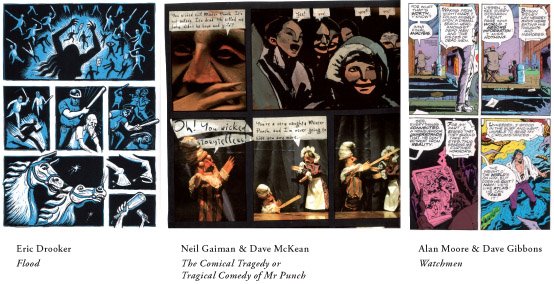
Here are three examples from popular graphic novels. The far right, Watchmen, is what most people expect a graphic novel to look like; primary colours, speech bubbles and it even has men in tights. But this was an ambitious and pivotal work in 1986 which changed the way people read, talked about, and envisioned graphic novels. The other two examples are perhaps more artistic than most would expect, but equally considered graphic novels.
To qualify as a graphic novel, the work needs to be presented as what Spiegelman calls “sequential art”; action takes place in frames, and the size and composition of the frames gives a sense of duration, of passing time. For this reason, I’d argue that graphic novels are more closely linked to cinema than literature, a point supported by the recent proliferation of graphic novels being adapted as films. Many would be aware that Batman, X-Men, Sin City and maybe even Ghost World or American Splendour were graphic novel adaptions, but also Tim Burton’s From Hell, about Jack the Ripper, Road to Perdition and A History of Violence. That these graphic novels are being adapted to film is arguably a combination of factors – the largest movie going demographic is 15-18 year old males, the stories are already in a cinematic form with consideration of action and movement, there is great potential to serialise them and create marketable spin offs. But also, and more importantly, there is now a generation of adults who grew up in a time where graphic novels are considered by many to be a legitimate cultural form, not just light entertainment for children.
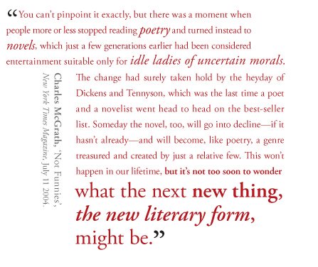
In an address to the Bristol Literary Society about the “Death of the Novel” in 1969, author and reviewer John Updike speculated: “I see no intrinsic reason why a doubly talented artist might not arise and create a comic-strip masterpiece.” And he has been proven correct. There are literally hundreds of articles from librarians and educators advocating the value of graphic novels and providing lists of appropriate works for different age groups. Graphic novels are even being recognised in literary circles:
 Art Spiegelman’s Maus, which shows parallel narratives of Spiegelman’s father, an Auschwitz survivor and Spiegelman’s present-day life in New York City, won a Pulitzer Prize in 1992; Chris Ware’s Jimmy Corrigan, the Smartest Kid in the World, won the Guardian’s First Novel Award in 2001, a controversial decision that apparently divided the judging panel.
New York Times reviewer Charles McGrath, whose quotation at the start of this lecture questioned what literary form may soon replace the novel, suggests graphic novels as a possibility, they are, he says: “what novels used to be—an accessible, vernacular form with mass appeal—and if the highbrows are right, they're a form perfectly suited to our dumbed-down culture and collective attention deficit.”
Although I’m sceptical that graphic novels could replace the traditional novel as the major printed storytelling medium, the comic-strip masterpieces envisioned by Updike have arrived, as evidenced in the commercial growth, visibility and accolades for graphic novels. Yet the medium is still not widely respected in Australia. I spent the first six months of this year hurrying to assure people that I wasn’t researching comics. Because that would have been a bad thing? There seems to be a prevailing sense in Australia, and many other Western countries, that images cheapen – or distract from – good writing. Images in books are either for children, the illiterate, or gimmicky add ons – a good piece of writing for an educated audience should stand alone as a written text.
Garrett-Petts and Lawrence (2000) describe an historical resistance to visual culture, claiming that “visual images are said to offer only superficial snapshots of reality – sight without insight.” (ix) They continue: “Any integration of visual and verbal literacies…presents a potentially disruptive challenge to the hegemony of word over image – and openly suspicious (even hostile) characterizations of the visual should be seen… as an anxious reaction to that challenge.” (3)
I want to pause here for a moment and clarify a term. Many contemporary schools of thought would appear to contradict this statement, arguing that we live in an image-centric world: Steve Johnson, in Interface Culture, states “If you live your entire life under the spell of television, the mental world you inherit from the TV is the supremacy of images over text.”
We constantly interpret complex iconic interfaces: on mobile phones, computers, menus on digital television, even buying a train ticket. Using a desktop computer, we have a choice of fonts, we can add images to documents and we can choose from and alter designed templates to make power point presentations and web pages. We can edit video footage and compose our own soundtrack to go with it. There is a growing awareness, certainly in the Western world, of how visuals work. As a designer I’m not necessarily advocating this as a good thing, I think all clip art and the font Comic Sans should be globally deleted. But I think it’s undeniable that as our entertainment and information technologies become increasingly visually demanding, we develop a more visually literate culture, more capable of interpreting visual texts. And we’re only now seeing the emergence of a generation who’ve never known the world any other way. Kress and Van Leewin argue in their significant book, Reading Images, that visual literacy will begin to be a matter of survival.
So when I’m talking about a culture which values word over image, I’m referring to a literary, print culture. I’m interested in books, and specifically fiction with integrated graphic elements. To discuss these books, I can’t ignore media arts like film, television and the Internet, just as I can’t ignore graphic novels and comics, because their influence on the wider culture is pervasive.
I’m also not saying that all writers and literary critics are anti-visual – they are in the middle of the same cultural shift, but literary print culture seems to be the last bastion of the mediums where the hegemony of word over image remains. And many want to keep it that way. Kress and van Leeuwin summarise; “the opposition to the emergence of a new visual literacy is not based on an opposition to the visual media as such, but an opposition to the visual media in situations where they form an alternative to writing and can therefore be seen as a potential threat to the present dominance of verbal literacy among elite groups.”
So perhaps it’s a sense of literary elitism of word over image that prevents people from accepting graphic novels as valid literary forms. Or perhaps it’s simply a lack of eduction on how to read them.
Marjane Satrapi, author of Persepolis, a bestselling graphic memoir of her childhood in Iran during the Islamic Revolution, didn’t start reading or making graphic novels until she was 25.
 In this page, a bomb has gone off on her street and she’s panicked that her family is dead. The longer panel shows her fear and shock being drawn out across that frame. By fluctuating the figure and ground in the next panel as she moves into darkness, with the speech bubble breaking through, you see very simple graphic elements can show a lot of drama. The blackness represents her fear, the white bubble the voice of hope, her mother.
On reading graphic novels, Satrapi says, “Like anything new, you have to cultivate your interest. It’s like in Opera. You have to go a couple of times to appreciate it.” I think what she means here, is that you have to learn how to read the language of a graphic novel before you can appreciate one. You need to be able to read and look at the same time, which is especially difficult if you’re used to reading quickly. This is not an easier form of reading, because it has pictures like a children’s book, it is a different way of reading. The sparseness of the written language requires the reader to draw a significant portion of the narrative from the images – not dissimilar to how we read life; by interpreting environments, gestures, body language, and facial expression. I define the term graphic novel as a description of a format, but also as a unique way of narrating, where word and image are integrated and inseparable.
Like it or not, graphic novels are emerging as a serious storytelling format. To discuss the potentials of integrating images in written storytelling, comics or graphic novels shouldn’t be ignored. Examining graphic novels and the discourse around them offers us a model for how to read images as narrative. They are the precursor, or older cousin, of a new writing style that incorporates graphic elements, which is my primary focus here. So, again, the two main issues to take from graphic novels when looking at works of contemporary illustrated fiction are:
1. Their plight for validity in a literary culture which values word over image;
2. The complex interplay between word and image in these multi-modal works.
Novels
Use of graphic elements in fiction is certainly not new: the history of word and image in print would fill volumes and I don’t have time to discuss this here. To grossly oversimplify, I’d argue that images have traditionally been used as decorative elements in fiction. Fancy title pages, or illustrated plates depicting characters or situations from the narrative were standard fare in Victorian literature, added or subtracted in different editions with no real effect on the narrative. What’s different about the emerging narrative style now, is that graphic elements are being used in a way intrinsic to the narrative, much in the way graphic novels use a combination of word and image that is inseparable.
These graphic elements are used as literary devices – they are integrated into the text as part of the narrative, rather than as accompanying illustrations. The image is no longer merely illustrating, or reflecting the written text, but elaborating, interrupting and sometimes contradicting it. You cannot remove these elements without losing essential parts of the narrative.
> Typographic experiments
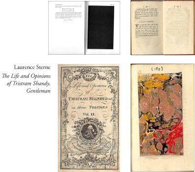
An exceptionally early example of this style is The Life and Opinions of Tristram Shandy, Gentleman, published in nine volumes between 1759 and 1767. Author Laurence Sterne uses an array of typographic and graphic elements to interrupt his written narrative, including: a blacked out page to represent the death of a character; a marbled paged to represent his father’s contribution to his conception; a blank page for the reader to draw his or her own likeness of one of the characters; elongated m-dashes and asterixes to insert pauses in dialogue and diagrams of how his storyline has meandered across the different books. These graphic interruptions are comparable to narrative asides (Schiff, 54) to consciously distract the reader, forcing a consideration of the “experience of interacting with the book as a consciously constructed object” (Schiff 30)
Peter de Voogd: “The text’s verbal and visual elements are so intimately interwoven that they form an aesthetic whole. Text and picture cannot be divorced from one another without serious loss: the picture is the text, the text the picture.” (in Schiff, 2005) Sterne uses typographic elements as literary device – they are not decorative, they are an integrated part of the narrative. Many contemporary books seem to continue from Sterne’s conceptual typographic playfulness to interrupt the flow and pace of a novel in an attempt to manipulate the experience of reading.
I’ve spoken about emerging generations who have grown up with a very different sense of primacy between word and image; who belong to a complex visual culture. Douglas Copeland knows this.
In his novel J-Pod, about a group of cynical 20-something computer-game developers who speak in movie quotes and advertising slogans, Copeland shows us that language looks different now; that dialogue looks different now; that some language has begun to resemble imagery. He switches typeface constantly, includes text fragments reminiscent of text message and computer languages like html, and pages of seemingly nonsensical numbers or symbols. I haven’t finished reading J-Pod, and will admit to skipping sections.
For example, a page that repeats “ramen noodles” in roughly 12 pt type for the whole page. I understand that the act of reading this page intends to impart a sense of boredom, of mundane repetition. I understand the concept without having to go through the process of reading it … in the same way I remember skipping meandering descriptions of the weather and country side while enduring Tess of the Durbervilles for high school English, and I don’t think I’m any worse off for it. Though I did count how many times ‘ramen noodles’ appears on that page; is it significant that there are seven columns of repetitions and 52 rows—reflecting the number of days in a week and number of weeks in a year—or am I trying too hard to make something of this? Perhaps this is the joy of unconventional elements; we’re not told how to read them, so meaning is open to many interpretations.
I’m not suggesting this use of truncated and coded language, spawned by new communication technologies, is a technique with much longevity. It grows tiresome quickly (for some by page one of the novel). But it is a technique appropriate to this story; it reflects the language and culture of its characters.
Likewise, Salvador Plascencia’s People of Paper, (McSweeney’s, 2005), includes several typographic devices that visualise aspects of certain characters. Passages obscured by black blocks of ink, reminiscent of Sterne’s black page, show Baby Nostradamus’s meditative state (a soothsayer who sees only blackness). Die-cuts removing words, (perhaps reminiscent of Derrida’s sous-rature, or ‘under-erasure’ technique) and passages with the ink fading away.
 Mark Danielewski’s House of Leaves and more recently Only Revolutions are highly experimental typographic novels. In House of Leaves, four narratives are distinguished by using four different fonts: this graphic element is practical one, to help the reader navigate. Complex grids and pages with very few words reflect what’s occurring in the narrative: characters make their way through the claustrophobic labyrinth of a house that defies real world logic, so the text is a claustrophobic grid of sections; at another point, characters are pursued by an unseen enemy, and a few words appear over a 25 page section, forcing the reader to flip quickly and engage with the pace of the novel. It also uses a colour coded system for some words, which is never explained. The word house always appears in blue – a reference to hyperlinks? The Internet abounds with theories, and there are online fanclubs … . Rick Poyner declared, “The positive reaction to House of Leaves suggests the degree to which readers’ tastes have already been transformed by exposure to devices, texture and rhetoric of contemporary graphic culture.” Only Revolutions tells two stories simultaneously. Reading the book forward is one character writing, flipping it over shows the other; supposed to read 8 at a time. Two book marks to keep your place in each story. For some people, this would be a nightmare to read, the constant physical disruption of turning the book too much to take. For others, an interactive reading experience. Not unlike playing a computer game.
A different approach to typographic experimentation is Graham Rawle’s Woman’s World, a 437 page novel created from 40,000 text fragments cut out from 1960s women’s magazines, reminiscent of the compositional experiments of 20th Century avant-garde movements such as Futurism, Dadaism and Constructivism. I haven’t read it, but according to many critics, it’s a “surprisingly absorbing thriller”. Design theorist Rick Poynor describes in Eye: “Despite its unconventional and perhaps initially daunting appearance, Rawle’s narrative grips as a reading experience from start to finish.” The use of graphic elements here actually drives the narrative from the outset.
Visually, Woman’s World may appear similar to Tom Phillips’ cult classic A Humument, first published in 1980, which he refers to as a ‘treated Victorian Novel’, but is actually conceptually the reverse.

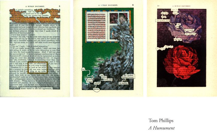 Where Rawle creates a narrative by repositioning phrases from magazines, Phillips takes an existing book—W.H. Mallock’s 1892 novel A Human Document—and visually ‘treats’ it, painting and drawing over pages to cover and reveal strands of text, again, using the graphic elements to generate the narrative from the outset. He writes, “I plundered, mined and undermined the text to make it yield to the ghosts of other possible stories, scenes, poems, erotic incidents and surrealist catastrophes which seemed to lurk within its wall of words.”
Rather than just typographic experiments, these books are artworks in themselves – the text becomes image.
 Umberto Eco’s dense tome, The Mysterious Flame of Queen Loana, was release with the strap line, ‘an illustrated novel’. The book’s protagonist, Yambo, suffers an incident that leaves him with profound memory loss of his personal life, yet he can remember the plot of every book he’s ever read and quote extensively from them. To retrieve his lost memory, Yambo returns to his childhood home and spends much of the book riffling through boxes of ephemera in the attic: old comics and newspapers, record covers, photo albums and diaries. The book is peppered with reproductions of the ephemera, and described on the jacket as taking “the form of a graphic novel”. In some editions, the cover actually resembles a graphic novel. Eco’s book needs the graphic elements to tell his story convincingly, but they are used in a more traditional illustrative way – the images are visual aids, in the sense an art or design book would contain illustrations of the work being discussed. They are interesting elements that add richness to the book, and it’s certainly a beautiful book, but they don’t contribute to narrative in a challenging way. It’s worth considering the fact that Eco is a prolific cultural theorist as well as novelist, and you have to question whether this use of cultural ephemera is more to do with sentimental indulgence than innovative writing.
To find more innovative, or challenging, integration of graphic elements, it's worth turning to new writers. Marisha Pessl’s début novel, Special Topics in Calamity Physics, also uses ‘visual aids’ – and even labels them as such, but these are more playful than Eco’s. The narrator and protagonist, Blue Van Meer, is an obnoxiously well read late-adolescent. She has been raised by her father, a college professor and Blue’s idol, who tells her; “Always have everything you say exquisitely annotated, and, where possible, provide staggering Visual Aids…” The story is a murder mystery, of sorts, and the reader is very conscious they are reading Blue’s interpretation of events. The visual aids are Blue’s drawings, and the fact that they are drawn is significant. Rather than photographs, they are the narrator’s interpretation—often from memory—of people and places. This visual technique mirrors the written recollections of events; you must ask not only why she has written about a character in a certain way, but also why she has drawn them as she has. You find yourself flipping back to the visual aids, looking for clues. And there are some. In particular, the second of three parts of the book, characters are ghosted on top of each other and into the environments depicted. This gives a sense of foreshadowing and perhaps implies that some of these characters may be more connected than you initially suspect. And I’ll say no more.
 Why are these visual aids, not illustrations? They do more than just depict something described in the text – they expand or elaborate on the text in a way that Eco or Picoult do not. It’s closer to a social scientist’s use of visual aids than a novelists, which is appropriate for this novel.
Pessl was 27 when she wrote Special Topics, and Jonathan Safran Foer was in his late 20s when he wrote his much-lauded second novel, Extremely Loud and Incredibly Close. I’m using these two authors as representative examples from a generation of writers who have grown up in a visually conscious culture.
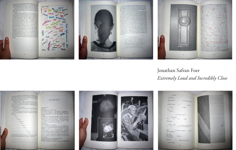
Extremely Loud and Incredibly Close uses an array of graphic devices, from photographs to proofreading marks and blank pages, to a flip book at the end which shows a man falling from the Twin Towers on September 11, in reverse. Oskar is the deliberately precocious 9-year-old protagonist of one narrative strand. His father dies in the Twin Tower tragedy and Oskar spends the novel on a quest to find the lock that fits a mysterious key he discovers in his father’s closet. He keeps a scrapbook he calls 'Stuff That Happened To Me', and images we assume are from this scrapbook are scattered through the novel. Included are photos Oskar takes of things he encounters during his quest, as if allowing the reader to see more accurately what he sees. But also included are images he finds on the Internet and in newspapers, where he sources much of his knowledge, occasionally inaccurately. A picture of Steven Hawkings, turtles copulating, Leyton Hewitt in what could either be a moment of victory or defeat. The fact that these are included in his 'Stuff That Happened to Me' book shows his inability to disconnect his personal life from the media. The photographs are a literary device that work with the text, and as a part of it. Safran Foer also includes typographic elements similar to Sterne – extra spaces, punctuation and almost blank pages to alter the pace of the reading. He says: “Most of what I do in my books I do exactly because I can’t explain in any other way.” (Gerber and Triggs, 2006)
ELIC was the 2005 Overall Winner in the V&A Illustration Awards. One of the judges, Mark Jones, described the book as, “A rare and really impressive example of a text with fully integrated visual elements. I like the way in which you encounter things that you don’t expect." Safran Foer didn’t actually take the photos – they were mostly found images, or commissioned. And although he apparently worked closely with the designer, he didn’t design the book himself. So we have an interesting blurring of territory.
On one hand, graphic novelist Chris Ware wins the Guardian First Novel Award and a writer wins the V&A Illustration Award. Amongst aggressive claims that just about everything is dying – the end of print, the end of fiction, death of the book, death the author … we’re at fascinating point in the history of literature.
The technology exists for a writer to produce their entire book themselves: they can compose, edit and layout their manuscript on a desktop computer, or portable laptop; they have access to digital cameras, scanners and pictures libraries to create or source images; they can output the whole thing as a pdf and send it to print. It’s possibly not too far from a point where they have a machine that binds the books in their printer, along with the scanner and fax machine, or dare I say it, they skip the printing process and email it straight to whatever ends up being the descendant of the Blackberry. Suddenly, I’m sounding very much like John Updike, suggesting that a doubly talented writer could produce a work of graphic and literary mastery. But just because you can doesn’t mean you should.
Prophecies aside, at this stage, it’s time to ask what this increasingly popular narrative style means for; A. the writer, B. the publisher, C. the reader and D. the designer. Although there are some fascinating considerations for the publisher and especially the reader, I’m most interested in the effect on the writer and designer.
Authorship
In 1923, amongst the compositional experiments of 20th Century avant-garde movements like Dadaism, Futurism and Constructivism, El Lissitzky declared, “the new book demands a new writer…the book finds its way into the reader’s brain through the eye, not the ear.” He titled himself a ‘book constructor’, and I think, expected this ‘new writer’ to emerge from the ranks of visual artists. Similarly, after the chest-puffing bonanza in the design world around the 1990s, when many called for the label ‘designer-as-author’ to be worn proudly, design critic Rick Poyner wondered in his book No More Rules (2003), where all these design-authors are?
There are designers who write, just as there are writers who design and illustrate. Generally, these people are the exception to the rule rather than the norm. I don’t think merging the two disciplines is a realistic future. I think it’s collaboration. To explore this narrative style in a way that won’t render it a passing trend, writers and book composers (to borrow El Lissitzky’s term) need to reconsider their relationships.
If it’s appropriate for a novel to include graphic elements for narrative, rather than decorative purposes, the writer and the book composer must consider the book’s graphic elements from the initial stages of the process, rather than cake decorating a manuscript once it has cooled. In the tradition of literary pairings from Roald Dahl and Quentin Blake to Hunter S. Thompson and Ralph Steadman, I think writers and book composers need to develop closer working relationships; they need to understand the way each other work and think. It’s something that graphic novel writers and illustrators do well.
What I’ve discussed is an interesting development in new writing that may be influenced by mainstream acceptance of graphic novels, or perhaps it’s print’s way of competing with the complex, interactive visual culture developing around it. Will illustrated novels usurp the traditional novel? No, I don’t think so. Because this isn’t a new genre or literary form, it’s style, and unless the graphic elements are appropriate to the content of the novel, it will only ever be a passing fad.

Comments
Have you looked at Nadja by Andre Breton? It has graphic elements of drawings/sketches and paintings that co-incide and also rupture the narrative. It is a surrealist text, I think.
The blog is really a place for me to put up thoughts and things I'm working through so people can give me feedback on my work, not so much as a resource for other people though I'm certainly happy if it is helpful to other researchers, but I'm sure you understand I just don't have the time to go through and reference everything I post.
Let's say those poor lonely footnotes just struck my sensible chord (and I was also eager to read a version I could quote without getting bashed by my teachers for having taking it on a blog)
Thanks again!